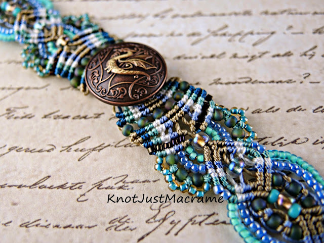
A customer asked me if I could make a dragon bracelet in the colors of sand and beach and surf and this is what I concocted. I mixed a sandy tan in with some turquoise and deep marine blue (the sparkling crests of waves and the deep troughs of color), added some sky blue and a little touch of the white of a couple fluffy clouds. Stirred them all together into a kaleidoscope of color and pattern, and came up with this:
I am so drawn to these colors, I think I will take it a bit further and see what else pops. Speaking of popping, which do you think works better in the photo: a patterned background like the photo above or a plain one like below?
The general consensus in some of the groups I belong to has been a plain, neutral background. My eye is more drawn to the patterned photo, though. Opinions?


I'd use more of a buff/cream color like the first picture, but without text. The grey of the lower one really just seems to wash out the picture.
ReplyDeleteWOW. I can't take my eyes of it.
ReplyDeleteI prefer the patterned background.
ReplyDeleteI like the patterned background. It's not too overpowering---it's perfect like your beautiful bracelet! You do beautiful work. Love the beach colors!
ReplyDeleteI love the rich colours of the first one with the patterned background. Will you be selling you pattern?
ReplyDeleteThis pattern is pretty much the same as the bracelet watch class on CraftArtEdu.com: http://craftartedu.com/sherri-stokey-micro-macrame-bracelet-watch
DeleteI love the first one because I love the colors. It is perfect to me.
ReplyDelete